
Task 1 Research and Planning
Introduction
In this assignment we have been asked to research the historical movements relating to communication and design for multimedia. We have also been asked to create a poster on the theme of directions for public display in locations such as airports, train stations or bus stations. Along with this we have been asked to create a CD cover design along with this. There are many different types of movements whenever it comes to graphics design as there is so many different types of way to design things such as posters, logos , CD covers etc. In this document I will be discussing the different types of graphical movements and giving examples on each. Graphic design is mainly the art of combining text and also pictures in advertisements, magazines or even some books. Graphic design Is used a lot when creating logo’s, banners, album covers and even some advertisements. Typography is also used significantly in these category’s and makes normal text words stand out and look more attractive.
Bauhaus
Bauhaus was first founded in 1919 in the city of Weimar by a German architect who was called Walter Gropius. The main core objective of the group was a radical concept; the concept was to reimagine the material world to reflect the unity of all of the other arts combined. Gropius created a craft-based curriculum that would turn out artisans and designers capable of creating useful and beautiful objects appropriate to this new system of living. The main initial aim was the unification of the arts through craft. The school adopted the slogan “Art into Industry”. The Bauhaus combined elements of fine arts and design education. The curriculum offered a preliminary course that immersed the students in the study of materials, colour theory, and formal relationships in preparation for specialised studies. The school consists of many different studies such as cabinetmaking (which was among the most popular), textile workshops, metalworking, and typography. In 1925 the Bauhaus moved from Weimar to Dessau where Gropius designed a new building to house the school. The building contained many features that later became hallmarks of modernist architecture including steel-frame construction, a glass curtain wall and an asymmetrical along with a administrative space for maximum efficiently.
As you can see from the furniture that the Bauhaus provided, all of the furniture was designed quite in an extremely modern style and is made of steel that the Bauhaus used to make quite a significant amount of pieces. When designing the Bauhaus used extremely modern and sleek lines to give their pieces a modern touch.
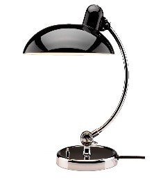
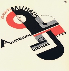
Whenever looking at some of the logos that the Bauhaus created you see that the typography that they used was very bold and think, they also used very dark colours and bold straight lines in their designs. The designs that they create are also made to have a modern feel which is represented across almost all of their pieces. The Bauhaus also used odd and uneven shapes to represent their work in their posters.
Constructivist
Constructivism was an artistic and architectural philosophy that originated in Russia beginning in 1919, at a time when the revolution of 1917 had been consolidated and the new Soviet government was building a new communist society. Through the 1920s constructivists developed radical new architecture, graphic design, film and photography and pioneered design styles for mass production. Constructivists applied the abstract with visual grammar with remarkable consistency across a wide range of design disciplines. Russian artists took cubism to its logical conclusion, developing supremacism which was a philosophy that sought to free art, design and architecture from dependence on traditional forms of representation. The new visual grammar was designed to allow free combination of primitive shapes, which for strange new artistic and architectural worlds.
As you can see from the type of art, the pieces use multiple shapes to create a piece of art. The art also gives the feel of being minimalistic which means that even though the art does not have a lot going on, the shapes give enough feel so that the piece does not feel empty. The shapes that are in the piece have a very impactful feel.
The colours and also shapes that have been used in this have been used to create a city scene. This is a very good use of the shapes and leaves the picture with a large impact to anyone who sees it. The colours that are used in this also has a very modern feel however they still represent the colours of the city quite well.


International Typographic style
The international typographic style which is also known as the Swiss style is a graphic design style emerged in Russia, the Netherlands and Germany in the 1920. It was made famous as it was developed by designers in Switzerland during the 1950’s. Typographic style has had profound influence on graphic design as a part of the modernist movement, impacting many design-related fields including architecture and art. It emphasises cleanliness, readability and objectivity. The style is also associated with preference for photography in place of illustrations or drawings. A lot of the international Typographic style works featured typography as the primary design element.
It is clear to see that this artist has used a different type of typography to visually enhance the poster itself by cutting out some of the text itself to create an unusual type of typography to make the post itself stand out from others. The post has also been given a black background and also white text to make it stand out and also to eliminate as much blank space as possible.
This is another example of the international typography style as typography has been used alone in the poster without any shapes or boarders to it and it still has the same effect, if the typography that has been used has a uniqueness to it then it will be able to stand alone in the poster. If you do not fancy dark colours, then bright colours is also a good choice as it will make the typography stand out a lot more and you also have more choice in what typography you want to use.


Dadaism
Dadaism was a form of artistic anarchy born out of disgust for social, political and cultural values of the time. Dadaism embraced elements of art, music, poetry, theatre, dance and also politics. Dada was not a style of art it was more a protest movement with an anti-establishment manifesto. Dada’s weapons of choice in their war with the establishment were confrontation and provocation. They attacked traditional artistic values with irrational attitudes and provoked conservative complacency with outrageous statement and actions. They also launched a full scale assault on the art world which they saw as part of the system. Dada questioned the value of all art and weather its existence was simply an indulgence of the bourgeoisie. Dada mainly claimed to be anti-art, the effect of Dada was to create a climate in which art was alive to the moment and not paralysed by the traditions and restrictions of established values.
As you can see from this piece of art that has been done by Dadaism, you can clearly see that they where protesting again normal art and wanted to assault the essence of the word normal “art”. This type of art did not want to be displayed as art but more of putting across the point that they where not going to follow the system. The images and colour that they use in this piece clearly are supposed to be provocative and give the impression of anger.
From this piece of art, you can clearly see that the Dada community where trying to send a message towards traditional artists and where trying to make fun of traditional paintings.
After considering all of the above graphical movements I have decided that I think Bauhaus would be best for the poster that I wish to create. I feel that this style would match what I am looking as I would like to balance my poster around shapes and also make sure that the post itself is quite plain and does not require a lot of technical.


Bibliography
Winton. A, http://www.metmuseum.org/toah/hd/bauh/hd_bauh.htm (accessed: 29 January 2016)
Furniturestoreblog, http://www.jbdesign.it/idesignpro/bauhaus.html (accessed: 29 January 2016)
CreativeBloq, http://www.creativebloq.com/graphic-design/easy-guide-design-movements-constructivism-10134843 (accessed: 29 January)
Wikipedia, https://en.wikipedia.org/wiki/International_Typographic_Style (accessed: 29 January 2016)
International Typography style, http://smearedblackink.com/swiss_style_timeline/ (accessed: 29 January 2016)
Eben Design, http://www.ebendesign.com/blog/articles/post/art-of-the-week-swissted (accessed: 29 January 2016)
Dadaism, http://www.artyfactory.org/art_appreciation/art_movements/dadaism.htm (accessed: 29 January 2016)
Influences on my choice of design
In terms of the influences on my choice of design that will be influencing my choice of what I will choose to do my poster on. One design choice that has influenced me would be the Bauhaus design. This design has influenced me enough for me to choose this movement to pick it to base my poster and the work that I complete on. Whenever creating my poster, I will include typograph, colours and also layout that will be based on the work of Bauhaus however I will also use my own creativity to manipulate the work and make it my own design. To do this I will make sharp lines and modernistic shapes in the style of Bauhaus and will also include some shadowed out landmarks on my experimental work and also the main and final piece. In terms of the place in which this poster will be displayed will mainly be airports and also airport terminals so that customer will know where the departure points are.
Proposal
The Movement that has been used
While considering all of the movements I have decided to choose the Bauhaus movement. The reason why I choose this movement was because it is simplistic and it is the type of movement that I could easily produce. The main use of bright colours was the reason why I choose the Bauhaus movement and also because the design on the Bauhaus movement is quite playful and not too serious. Bauhaus was a school that was based on the development of typography and other areas, the school was founded by Walter Gropius in Weimar in Germany in 1919. Producing typography was the school favourite area to work on in 1919 and excelled the school to higher heights.
Fonts and Typography
In terms of talking in consideration that Bauhaus created different types of artwork with this in mind the colour scheme that I feel that will be best for the type of poster that will be the typography that I will choose. I will use the typography that will suite the theme of Bauhaus and I will also make the poster eye catching and modern which will also be in the theme of Bauhaus.
Colours and shapes used
Whenever you look at colours that Bauhaus used for their poster, the colours that I will use in my piece of work will most likely be of my own choice however I will keep into consideration and will mostly base my work around the movement that I have chosen to base the poster that I am making on. The colours that I will use in my poster will be very vivid and bright to base it of the movement that I have chosen, I will mainly use colours that will work well together and blend together well so that the colours match each other and look presentable. In my poster I will also use a lot of thick and straight lines to make my piece look modern looking and also so that it will stand out. When it comes to shapes I use this will mainly be a lot of squares and also rectangles to make my poster modern looking and to keep it in line with the movement that I have chosen.
Influences
The influences that would affect my choice of design would mainly be the fact that Bauhaus used simple symbols and shapes to form his pieces of art, as I have chosen this movement then I will be following this and using a lot of symbols and also different types of typography to produce my poster and base it upon Bauhaus’s design. However, when producing the poster, I will include my own creativity to also influence the poster that I will be creating. When creating the poster, I will use different shapes and also straight and narrow lines and also circular lines to appeal to modern artists today. This will help me create a modern but also quite playful poster design.
Layout of my poster
Whenever it comes to the layout of my poster, the layout will be based on the movement that I have chosen which is Bauhaus. Whenever creating my poster, I will try and re-invent the Bauhaus movement and put my own style into the poster itself. In my poster I will have a lot of shapes and will also use the Bauhaus font to represent the Bauhaus movement.
List of Resources
- I will need to use printers to produce my work so in that case I will need to source own printers to print my poster in A3 form.
- Whenever creating my poster, I will need to use copyright free images in my poster. So in this case I will need to source out copyright free images to use in my poster.
- To be able to get my thumbnails onto my computer I will need to source out a scanner to use so that I will be able to put my thumbnails onto the blog itself. In this case I will need to source out a scanner to do so.
- To complete the assignment, I will need to be able to put the information that I gather onto a blog for presentation. To do this I will need to find a blog web application to do this.
- To be able to create the poster and also the CD cover I will need to source out computer applications like Illustrator and Photoshop to create the poster and CD cover. I will also need these applications at home to complete the assignment in my free time.
- I will also need to create a thumbnail template on Photoshop and also use paper, pencils and also colour pencils to create the design layout for the thumbnails.
- When creating the CD cover I will also need to source copyright free fonts and also images to use on the CD cover.
List of Directions
England– When it comes to locations that I could have used when creating my poster England was among one of them as there are a lot of landmarks in that country that I could have used in the poster itself to represent the poster in an airport departure point. If I did pick this country, I could have used big ben as a main landmark and also different shapes and think lines in the poster to make the poster more modern. This was my second choice after Ireland to do as there was so much content that I could have used to create this poster.
Ireland– In terms of countries that I could have used for my poster this is the one that I have chosen. The reason why I picked this country is because there are a lot of different landmarks in Ireland and also because I had a lot of different ideas design that I could use within the poster. The main design that I am going for is mainly to do with different shapes and also different colours so that I will be able to make my poster stand out with think straight lines and also so that it will be modern. I felt that a poster like this would go quite well in an airport terminal to direct people to this particular departure point.
America– America was another country that I thought would have been good to produce a poster on as it also has a considerable amount of landmarks must like the country of England. The main idea that I had for this poster was to make the background the same colour as the American flag and also use the stars on the America flag as shapes. I would also use straight black lines around the flag itself to make the flag seem more modern and stand out a lot from other posters.
France– Whenever it comes to the France poster, this was the one that I was least likely to pick as I did not know what way I could design a poster for this type of country. However, this design idea was used as a backup plan if I could not decide which country to pick to design my poster on.
| Week | Class 1 | Class 2 | Class 3 | Objective/Possible Outcome |
| 1 | In the first class of the new unit the assignment will be handed out to us and explained to us on how long we have to do the assignment and also the hand in date for the assignment. | In the second class of the first I will begin on starting the first task which will be the Planning and Research and will continue to work on at this throughout the second class also. | In this class I will be continuing to work on at the Planning and Research part of the task and I will also start to look up on some design on what I could do for my poster towards the end of the class. | The main objective for this week will be to almost complete the Planning and research within class time and also begin to work on some experiments towards the end of the class and throughout the week at home. I will also have the planning and research finished for the beginning of the first class for the second week. I hope for the outcome to be that I will have finished the Planning and research and started to work on some ideas for my poster. |
| 2 | In this class I will have started to work on the Proposal that I will hopefully have finished with the first and also second class. | By the end of this class I will hope to have the Proposal finished and I also hope to start working on my Two Experiments within the class. | By the end of this class I will hope to have at least one experiment finished and will also finish the second experiment at home for the start of the first class for week three | The main objective for this week is to have both the Proposal and also the two experiments finished by the start of class one week 3. I hope that the outcome will be that I have these things finished for week three. |
| 3 | At the start of this class I will hope to be working on the Thumbnails and also the List of Directions. This will role on to the second class also. | During the second class I will hopefully still be working on the Thumbnails and also the List of Directions. By the end of this class I hope to have these finished. | By the third class I hope to be fixing up some of my Design Development Documentation and also annotating the screenshots that I have taken. By the end of the class I hope to have this almost finished and finish this in my spare time for week four. | The objective for this week was to finish the thumbnails and also list of directions. I also want to have the design development documentation started and also almost finished as it is coming up to the end of the assignment. The hopeful outcome for this week is to have thumbnails, the list of directions and also the design development documentation up to date. |
| 4 | Week four will be a midterm break so there will be not classes, however in this time at home I will be working on the Final Design and also my Evaluation work after everything has been completed and also displayed on the blog. | The outcome for this week is to have the final design completed for hand in and also have the evaluation completed at home. The possible outcome is to have everything completed for the hand in Date the next week. | ||
| 5 | At the start of this class I will have checked over my work and made sure that I am satisfied with everything so that it is ready for hand in. Whenever I am happy with everything I will submit it on Moodle. |
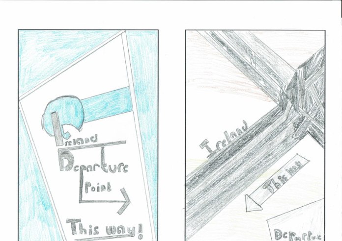
These are the thumbnails that i created and scanned onto the computer. These are the same as the experiments that i have provided only they where hand drawn before i did the experiments themselves.
