
Graphics for branding
When it comes to brand identify and also branding in whole. Whenever it comes to different type of branding, in terms of the graphics that will be needed for the branding itself. In some cases, 3D branding will be needed to make things such as adverts and logos stand out and make them more eye catching to a viewer walking by. Also things such as marketing campaigns or anything else that a company would do in terms of events would need to have some sort of logo image or banner that shows what they are representing. The logo that is designed for this would need to be graphically sound and stand out on a letter head or anything that would be promoting the company itself.
The evolution of typography
The evolution of typography began with cave drawings that date back to 20,00BC. These are perhaps the first recorded forms of typography. However normal formal writing has been said to be developed at around 3,500BC. Whenever civilisations started to advance, Egyptian hieroglyphics where introduced and used by the Egyptian people as forms of communication. As the middle ages came, this was all about hand-written illustrated manuscripts. This then led to the evolution of a wide range of different writing styles. Whenever it comes to present day typography, all these types of typography are used in almost everything including different types of adverts and displays and also different types of company logos and letters heads. This can also include business cards and t-shirts and so on. Typography is used quite widely today and is knows to be used most in a lot of different types of art and also designs.
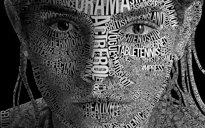
Typography as an image
Typography as an image is something that has recently popped up in the industry and is slowly taking control. Typography as an image is something that can give a lot of meaning and can put across an image quite significantly to the view of the image. It is a delicate art that uses words to create an image. The words that would be used in the image would be related to the image that would be displayed at the time.
Whenever you look at this logo you see that the typography that is used within it is basically classes as an image because it is being used as a logo. The type of font that is being used instantly crate the image of the famous brand of Kit Kat. Also the colours that is being used in the image also creates the image of the Kit Kat as they used the colours of white and also red.
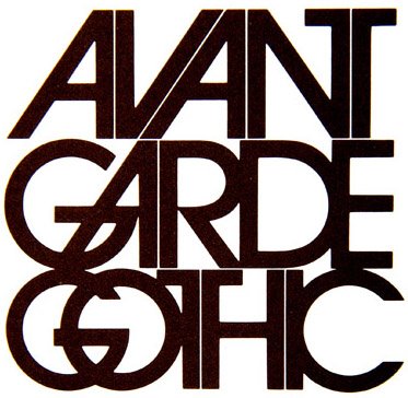
Whenever you look at this image this is also another good example of typography that is being used in an image however this piece does not used words to make up the image, they use letters and also colours to make up the image and to make the image look proper.

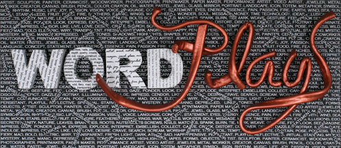
Creative word play
Creative word play is a way to manipulate words to make them form an image. Creating an image with certain types of words is a common practise in both animation and logo making today and is used by many different multimedia professionals in the industry to create professional. Whenever using creative word play the artist creates and twists certain words around in the form of a picture to create other different types of words and also letters. These letters then usually form to create another type of image or picture out of the shapes of that the artist uses.
Developments in web graphics
A lot of businesses and companies today use an online website to market and sell products to people around the world and to basically get their products out there. As a significant amount of people would be getting their first impression of the business of the website, companies and smaller businesses today try and make their websites look a certain way to reflect their business in a positive light. Websites today have many different graphical and interactive features that the users can interact with to make their experience within the website itself more fun and enjoyable. Whenever you look at the start of websites and what they are now, there is a tremendous leap in technology and also interactivity as more and more effort is going into things such as colour used within the website, what the logo will look like, implementation of Audio and visual concepts.

Graphics such as different shapes and images are being used in web graphics to make them stand out from other different websites and to make them more colourful and also attractive to the public. Different types of colours and shapes are being blended together to create something new and vibrant for the public to make it stand out from others.
Typographical logos
Typographical logos have become quite popular nowadays as a lot of companies want to use something quite professional however they do not want a very technologically advanced logo. This is the reason why this type of logo form today has become so popular as it looks professional and sleek depending on the typography used to make the logo itself. This type of design process can be easily played with and made into a unique type of logo for a chosen business as there are so many different types of typography that can be chosen.
Brochure layout and T-shirt design
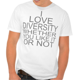
Brochure and also company t-shirt design are a good way to create a message and get it out there to the public. Brochures basically provide the message that they are trying to put across along with a ton of other information about the company including what they are doing, what their aim is and what they hope to achieve. T-shirts are good to draw attention to the particular organisation supporting the human rights act and are a fun way to get people to join in and represent the company. The T-shirt also gets the organisation recognised.
The Functions of graphic Design
What is Graphic Design?
The main definition of graphic design is that it is the mythology of visual communication and problem solving through the use of type space and also image.
Information
Whenever you look at the use of graphic design through information. Whenever you use graphic design to create either a logo or an image for a company, the logo or image has to give off certain information to the person who is looking at the image. In terms of my own logo and designs they will have to give off certain information to the viewer that is logo at the logo and t-shirt etc. There are many different signals that a logo can give off to the viewer such as professional, fun, serious, helpful. This can all depend on the colours and images that is used inside the logo or final image.
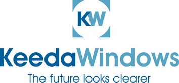
For example, this logo is for a window providing company. The way that they have represented their logo is that they have used colours that represent a window and have used light blue colours to give the effect of being able to see through the logo. The have also gave the name of the company also their slogan.
Persuasion
There are a lot of ways in which you can use graphic design to persuade people to do something in a logo or a billboard etc. Things such a colour or even the types of words that are used can persuade people to do something or give them the feeling that they want a certain thing. A good example of this is an image of certain food, depending on the colours of even the placement of the words that are being used this can give the viewer the feeling that they want or even need that certain product. Some companies also create their logos in the forms of food to make the viewer Hungary so that the viewer will go and buy their products.
Meaning and Layout
The meaning and the layout of a certain design can be very important whenever creating a logo or even type of poster. The meaning behind a piece of graphic design can be quite important and can be shown in the image through the layout itself, colour, font and other types of elements. The meaning can be very important because if a certain image such as a logo or even a poster does not give away a certain meaning then the logo itself is pointless and not up to standard. In terms of situation that I picked, the logo for that company will need to give out a certain meaning such as “together” and possibly even “not alone”. The meaning will be represented through the layouts and the colours used within the image.
Signs and codes
Signs and codes within a logo or image can be quite tricky to get right, however placing a direction or code into something can be a very effective way of getting the viewer to do something or even go somewhere. Signs and codes are used everywhere today for many different purposes and can be implemented into many different areas of graphic design. Placing a code into a logo can be perceived as a hidden message into the logo. Whenever it comes to the logo that I will be designing I do not believe that I will place and signs or even codes into the logo itself however this will be considered in the experimental process.
Grid Based Layout
A grid based layout in a design is important to keep the design looking nice and important to the company itself also. Whenever designing the logo, itself, the logo needs to be in a grid based layout so that all of the designed images in the logo itself are even so the logo does not look messy and out of sync with the rest of the companies. Whenever a logo is being designed a grid based layout is needed so that whenever the logo is being designed the logo will be easily made and will slot into place with all of the other images that would be included.
The Key Principles of Typography
Font Choice
Whenever it comes to font choice whenever creating your typography, this is one of the most important things that you need to consider and take into consideration as this is what you are going to base your typography around and create something unique to you. There are two different types of scrip fonts that you can use, the first one is serif, serif fonts have extra bits on the end of the letters however sans serif fonts are the letters without the extra bits. The script fonts imitate handwriting and monospaced fonts are fixed width with each of the characters being equal width. Whenever creating a type of logo both serif and sans serif texts can work quite well together to create quite a unique logo.
Size
Size is also quite important in terms of typography as it has to be created at just the right size to fit the layout that you have created, depending what the typography is going to be placed on it can be used as multiple sizes depending on the situation. If the logo is needed for a web banner or a T-Shirt it is usually scaled down to fit that perspective, however if that particular typography is needed for a business card or even just the logo on its own it is usually of a much bigger scale. However, the typography within the logo itself can have a large effect on the way that the logo looks, if the typography is too large then the logo is not going to look right and will looked too in your face and squashed into a certain corner. If the logo typography is too small, then it might not be able to be seen whenever it is scaled down to fit something that needs a smaller image. This is the reason why size is so important whenever creating typography.
Letter Spacing and Line Height
Letter and spacing can be an important part of creating any type of typography, weather it be in a logo or even in a text document. The line height and spacing mostly refers to typography being used in a document as the spacing between certain lines of the document is important to make sure that the words and images are not too cramped together. If this would be the case then the document would look messy looking, if the typography is spaced out well and line height is not too high or short then the document would look professional and not out of place among the document. This is usually very important in brochures as spacing and line height is crucial for the proper layout of the brochure.
Readability
Readability is another crucial part of typography. Depending on the type of and size of font that is chosen by the creator, this will depend on how readable the typography is. If the creator has chosen a type of typography that is very complicated to understand and has made the size of the font too big or even too small, then this can have a pretty large effect on the readability of the typography itself. This is the reason why the typography has to be evenly created and the typography that is chosen should be clear and bold so that it is easily understandable.
Typographical Works
Jan Tschicold- Jan Tschicold was born on the 2nd April 1902 in Leipzig, Germany. He was the son of a provincial sign writer and he was trained in calligraphy. This type of training set him apart from almost all of the noted typographers of that time period. Since Jan had never trained within architecture or even the fine arts explains why he never worked with handmade papers or even custom fonts as many different typographers or that time did. Jan preferred normal stock fonts on a careful choice of different paper stocks. In 1923 Tschicold converted to modernist design after visiting the first Weimar Bauhaus exhibition. He then became a leading advocate of modernist design, first with an influential 1925 magazine supplement and then a personal exhibition in 1927. Between the time of 1926 and 1929 he designs a universal alphabet to clean up a few multigraphs and non-Phonetic spellings in the German language. He designed a few new letters that would replace the multigraphs “ch” and “sch”

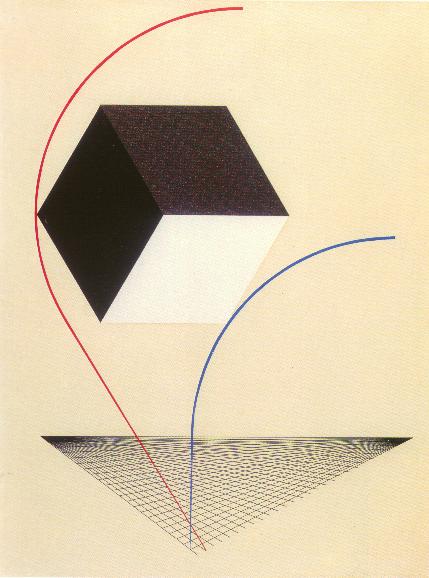
El Lissitzky
El Lissirzky was a Russian artist. He has been known for his typo graphing works of art. He is also known as a photographer and architect who mainly designed a lot of different propaganda posters for the Soviet Union back in the early twentieth sentry. The ideas that El Lissitzky had included the development of the ideas behind the supremacist art movement were very influential in the development of Bauhaus. Whenever it came to the earlier years of his work he started to develop a style of painting in which he has used abstract geometric shapes.
Paul Rand
Paul rand is one of the Swiss style graphic designers who was born on August 15th 1914. Rand was educated in the Pratt Institute from 1929 to 1932. Rand taught at Yale University in Connecticut, his particular interest was graphic design. Rand taught at the university from 1956 to 1969 and was inducted into the New York Art Directors Club Hall of Fame in 1972. He revolutionized the graphic design industry by designing posters and corporate pieces including some logos for IBM and also ABC.

Craig Ward
Craig Ward is a New York based designer and also art director who was born in Britain. He is mainly known for using typographic work and also using scientific solutions to certain projects that he is working on. The modern styles and also colours in Craig’s work puts across the point that Craig makes sure his work is up to a more present standard and has a more modern feel to it. Craig mainly uses a variety of different techniques whenever creating his pieces of work to enable him to create many different effects.
Oti Aicher
Oti Aicher spent most of his time in the German Army against his own beliefs, he had a keen interest in corporate branding. He was born May 13 1922 and in 1969 he requested to design the logo for a German Airline which came out the same year. The war that he was forced to fight in greatly affected him and inspired most of the work that he commissioned. Otl’s most notable work was with the Olympics in 1972 where he designed pictograms for the summer Olympics.

Neville Brody
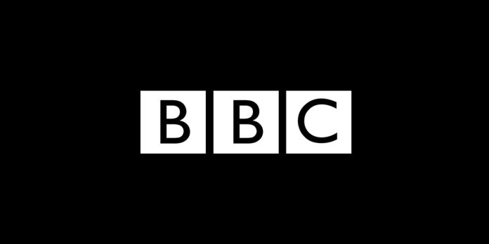
Neville Brody born in London on 23rd April 1957 was an art director of a popular magazine called The Face. Brody revolutionised the industry publishing pieces of his own work as art director for the magazine which made his work become so popular. Brody is also a part founder of Font shop and has also designed a range of fonts and typefaces such as Insignia and blur. Although Neville made a name for himself his recent work found himself working for the BBC and rebranding their logo in 2011 making an even bigger name for himself.
David Carson
David Carson is an American graphic designer, his designs are not of the normal type and evokes the viewer of his work to study it and find the meaning behind it. David Carson was born on September 8 1954. David Carson is mostly looked up to in the world of art and to this day he is still a very influential designer and artist in the world of art and design.

Armin Hofmann
Armin Hofman is a Swiss graphic designer who was born on June 29th 1920. Armin Hofmanns creative designs have a certain style that is used to create the goal of communication and to be the centre of someone’s conversations to create communication. Armin Hofmann also experimented with other types of graphic design such as photo-type setting and also experimental composition.

Alan Fletcher
Alan fletcher is a graphic design artist that co-founded his own graphic design firm in 1962 called “Fletcher Forbes Gill”. Alan himself was born on the 27th September 1931. Alan Fletcher worked on a multitude of different graphic design projects from other different corporate company’s which took his company to success and make his commissions famous. One of the major works that he commissioned is still be used today which was for Reuters which was made back in 1965 whenever the company that he co-founded was at the peak of the industry.
Herb Lubalin,
Herb Lubalin formed his own design company consultant firm in 1964 which is what is now known as the world’s first international graphics cartel. Herb was born on March 17th 1918. Herb was an American graphic designer that decided to do it on his own and start up a design firm so that he could share his graphic designs with the world. The work that Herb mainly focused on was typefaces and how they mainly could dramatically impact upon the message that is displayed.
Stefan Sagmesiter
Stefan Sagmestir formed the New York based Sagmeister Inc in 1993. Through this company he started to design branding, graphics and also packaging for multiple different companies. The clients that he did branding for are still about today such as the Rolling Stones and also HBO. Stefan himself was born on August 6 1962. He was originally a New York based graphic designer.
Paula Scher
Paula Scher is an American graphic designer. She was born on 6th October 1948 in Washington D.C. She began her career by creating different album covers for recording companies across America. Paula did not begin to create her own designs until she decided to open up her own design company. Paula began to work and grow her fame by working for different companies that were satisfied with all of her work, she then began to move on to design for more prestigious companies such as Citi Bank and even Coca Cola. Her design type is like no other as she communicates with different temporary audiences through the use of her pop iconography much and also even film.

Chip Kidd
Charles Chip is best known for different and also innovative book covers that stand out to his audience. He has also published two different books which are called Cheese Monkeys and The Learners which he basically designed himself without the help of a publishing company. Charles was born on September 12th 1964 and is an American graphic designer. The typography that he used within his books are used to make points alongside the narrative of the actual book.
Alex Trochut
Alax Trochut is best known for his different Spanish art. He is also known to be a graphic designer, illustrator and also a typographer and is currently based in Brooklyn. During his career he has created many different iconic pieces such as the cover for Katie Perry’s Road album along with a bunch of other different designs that has excelled him to the top. Alex was born in Barcelona in 1981.
Christopher Wool
Christopher Wool is best known for his large black stencilled letter paintings on white canvases and is also known for a wide range of styles by using different artistic techniques. Christopher was born in Chicago Illinois in 1955.
Bibliography
Sydwalker,26 Feburary 2016,(accessed 26th February 2016) http://sydwalker.info/blog/wp-content/uploads/2011/05/Destroy_this_mad_brute_WWI_propaganda_poster_US_version.jpg
Mcmaster, (accessed 26th February 2016)http://pw20c.mcmaster.ca/files/pw20c_images/00000902.jpg
(accessed 26th February 2016)http://all-that-is-interesting.com/20th-century-anti-marijuana-propaganda
Wikipedia, (accessed 6th April 2016) https://www.google.co.uk/search?q=El+Lissitzky&espv=2&biw=1920&bih=979&site=webhp&source=lnms&tbm=isch&sa=X&ved=0ahUKEwiAtv7IwfrLAhVM2BoKHcS-AW0Q_AUIBigB#imgrc=CytQY_z2FL6yAM%3A
125.pratt.edu, (accessed 6th April 2016) https://www.google.co.uk/search?q=El+Lissitzky&espv=2&biw=1920&bih=979&site=webhp&source=lnms&tbm=isch&sa=X&ved=0ahUKEwiAtv7IwfrLAhVM2BoKHcS-AW0Q_AUIBigB#tbm=isch&q=pAUL+rAND&imgrc=TRJQFND9H1vToM%3A
Wordsarepictures.co.uk, (accessed 6th April 2016) https://www.google.co.uk/search?q=El+Lissitzky&espv=2&biw=1920&bih=979&site=webhp&source=lnms&tbm=isch&sa=X&ved=0ahUKEwiAtv7IwfrLAhVM2BoKHcS-AW0Q_AUIBigB#tbm=isch&q=Craig+Ward&imgrc=hOfWKS0-FjpoyM%3A
Tomaszmaxxis.wordpress.com, (accessed 6th April 2016) https://www.google.co.uk/search?q=El+Lissitzky&espv=2&biw=1920&bih=979&site=webhp&source=lnms&tbm=isch&sa=X&ved=0ahUKEwiAtv7IwfrLAhVM2BoKHcS-AW0Q_AUIBigB#tbm=isch&q=Oti+Aicher&imgrc=gSOEVhx39qLuoM%3A
Corkwallis.com, (accessed 6th April 2016) https://www.google.co.uk/search?q=El+Lissitzky&espv=2&biw=1920&bih=979&site=webhp&source=lnms&tbm=isch&sa=X&ved=0ahUKEwiAtv7IwfrLAhVM2BoKHcS-AW0Q_AUIBigB#tbm=isch&q=Neville+Brody+bbc&imgrc=M-OHxQG0p3YT5M%3A
Va312iremakdogan.wordpress.com, (accessed 6th April 2016) https://www.google.co.uk/search?q=El+Lissitzky&espv=2&biw=1920&bih=979&site=webhp&source=lnms&tbm=isch&sa=X&ved=0ahUKEwiAtv7IwfrLAhVM2BoKHcS-AW0Q_AUIBigB#tbm=isch&q=David+Carson&imgrc=LNv3XfkC02Tw4M%3A
Flyergoodness.blogspot.com, (accessed 6th April 2016) https://www.google.co.uk/search?q=El+Lissitzky&espv=2&biw=1920&bih=979&site=webhp&source=lnms&tbm=isch&sa=X&ved=0ahUKEwiAtv7IwfrLAhVM2BoKHcS-AW0Q_AUIBigB#tbm=isch&q=Armin+Hofmann&imgrc=U8nPjMphBftS3M%3A
Thinkingform.com, (accessed 6th April 2016) https://www.google.co.uk/search?q=El+Lissitzky&espv=2&biw=1920&bih=979&site=webhp&source=lnms&tbm=isch&sa=X&ved=0ahUKEwiAtv7IwfrLAhVM2BoKHcS-AW0Q_AUIBigB#tbm=isch&q=Alan+Fletcher&imgrc=0j3nYXzbabQhMM%3A
Meetinghouse.co, (accessed 6th April 2016) https://www.google.co.uk/search?q=El+Lissitzky&espv=2&biw=1920&bih=979&site=webhp&source=lnms&tbm=isch&sa=X&ved=0ahUKEwiAtv7IwfrLAhVM2BoKHcS-AW0Q_AUIBigB#tbm=isch&q=Herb+Lubalin&imgrc=J2hg1vzIpjwcSM%3A
www.psfk.com, (accessed April 6th 2016) https://www.google.co.uk/search?q=El+Lissitzky&espv=2&biw=1920&bih=979&site=webhp&source=lnms&tbm=isch&sa=X&ved=0ahUKEwiAtv7IwfrLAhVM2BoKHcS-AW0Q_AUIBigB#tbm=isch&q=stefan+sagmeister&imgrc=hQfAx9NQPpapBM%3A
commons.marymount.edu, (accessed 6th April 2016) https://www.google.co.uk/search?q=El+Lissitzky&espv=2&biw=1920&bih=979&site=webhp&source=lnms&tbm=isch&sa=X&ved=0ahUKEwiAtv7IwfrLAhVM2BoKHcS-AW0Q_AUIBigB#tbm=isch&q=Paula+Scher+&imgrc=Arvb0mU8UuXvsM%3A
