
When first seeing the assignment and reading over the brief of what needed to be included, I noticed that two experimental pieces of work needed to be submitted along with our final piece of work. At the time I decided that the best place for my to get inspiration for some experimental work was YouTube and a could look up upon some design that have already been done. This would also allow me to get used to Illustrator and figure out what each individual accomplished.
First Experiment Development
I first started with looking up some design to be made in both Illustrator and also Photoshop and to learn how to move images from one to the other without distorting the image. The was the first tutorial that I watched and it gave me some inspiration on what I could do for my second design.

After following along with the tutorial I managed to create the shape as best as I could from following the tutorial itself. After I had created the image I opened Photoshop and imported it so I could edit the background and add some font and possibly some other shapes.
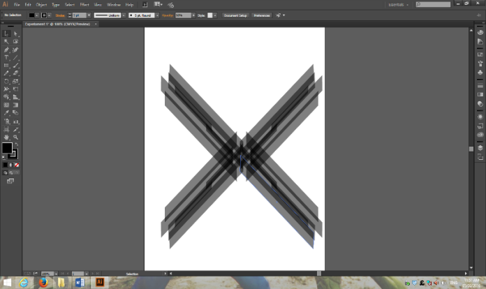
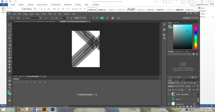
Whenever I imported the shape that I had made on illustrator to Photoshop I started to play around with it and place it in a certain position that I was happy with and followed the movement that I had picked as best as possible. Although the tutorial itself told me to put the “X” image a certain way I decided that it would look better this way to follow along with the movement that I choose.
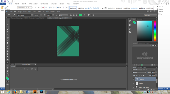
When I decided that the “X” image was in the correct possession I decided to mess around with some colour that I thought suite the style of the image. The screenshot I picked here was not the final colour that I decided to pick however in the end I decided to pick a range of different colours to make the screenshot stand out.
While still experimenting with different colours I decided to put a small shit at the bottom left side of the page where the “X” image ends to give the image itself a small bit of flair and to make the image itself stand out a little more.

When it comes to the background. I decided to choose quite light colours to make the poster stand out and look much better. This made the poster itself a lot more lighter and easier to look at.
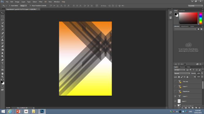
After fixing the colour of the poster I decided to start to add some text. The text that I used was the Bauhaus font as I wanted to keep the theme that I am trying to relate to in most of the poster that I will make.
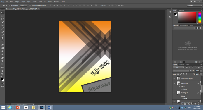
When putting the previous text in I then made sure that all of the text was finally placed in. As this was my first experiment it did not look as good I hoped it would however I tried to make it the best of my ability and make sure that it was up to the standard that I wanted it to be and that it was finished on time with the schedule that I set.

Second Experiment Development
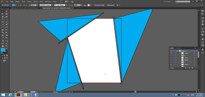
In this experiment I decided to mess around with some shapes and see what I could create whenever doing this. In Illustrator I decided to experiment with some right angle triangles and try and create a boarder for the poster itself based around some of Bauhaus’s work samples that I have seen on google so I decided to base this piece around that theme.
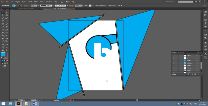
After creating and being happy with the boarder that I placed around the poster I decided to add a little more shapes into the mix just to see how it would turn out. So I saw one of Bauhaus’s work on google and decided to base the shape layout like this. I decided to go with a light blue and also grey colour to this poster to give it a modern feel. To create the strange shape inside the circle itself I just typed out a “b” and colours the font in white so that it would almost show the impression of the circle being cut.
Whenever I was finally happy with the placement of the circle and also the rectangle that I used I decided to add a little bit of text in to see what way it would turn out. I decided that the letter “I” could go into the slot where the “b” had cut off. Whenever I placed the letter in the slot I decided that it needed to be bigger than the rest of the text to give it a modern feel. I made the text itself grey to fit the theme of the poster.
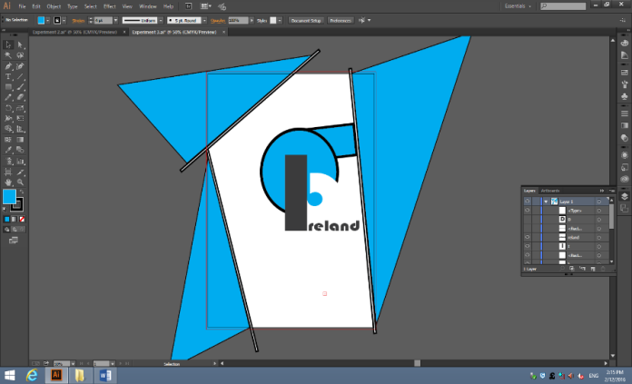
Once I had finished placing in the letter I I placed in the rest of the text that I thought needed to be there and made some of the letter connect to each other like that where dripping like paint. I did this because this type of art was created by the movement that I am currently basing my posters on. I also made the arrow in this style and made the arrow with rectangles to make it look unique and different.
Final Piece Development
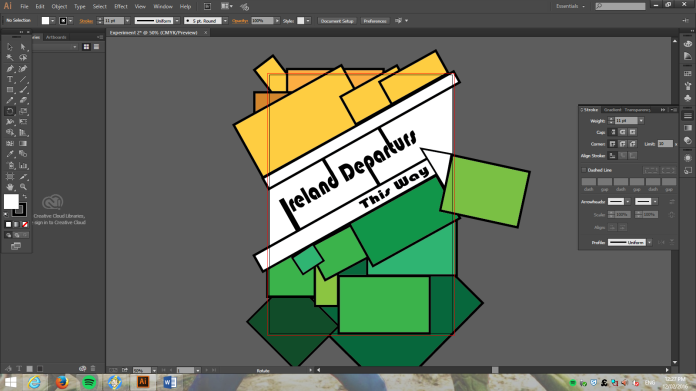
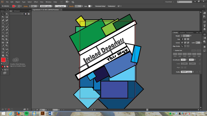
Whenever I started to make the final piece I had a general idea of what I was going to do. I decided that I was going to use a lot od different rectangles as a background for my poster and to make each rectangle a different colour. I also decided that I was going to incorporate a style from one of my experiments cause I liked to use that type of style.
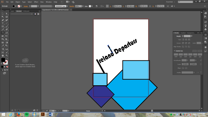
At this point I knew what I was doing and also decided to add the dripping text style that I decided to use in one of my earlier experiments cause I thought that type of style looked good and I liked to use it in my designs. I had also decided that the text was going to be in the middle of the base and the text would be in a box by itself with no background to cut of the shapes.
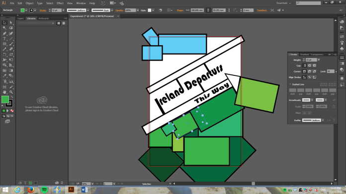
When I put the colours into the shapes themselves I decided that they might not suite the purpose and may be to diplomatic as I was originally going to colour them the same colour as the Irish flag. I decided to go against this and make them two separate different colours that I thought matched each other and also the style of the design.
In the end this was the final piece that I decided looked right and I thought looked pretty good as I had never used Illustrator before and that I am not very good at designing, I thought that I looked ok for my ability of creating posters and I was happy enough for this to be my final piece of work.
CD Cover Development
In terms of the CD cover I made sure that the image itself was scaled down so that the image would fit in the size of the CD cover itself. I also took some images out of the back of the CD cover to make it look slightly different looking from the poster itself so that they did not look exactly similar. When making the poster itself I also made sure that there was a bar code and also copyright included as if the CD cover itself was genuine. I also put an audience warning so that the CD cover was designed to be for everyone at all ages.

When creating the CD cover I made sure that the height was 127mm and the width was 254. In the design of the document I also had a 3mm bleed on the design.
