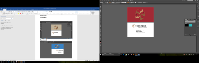
Experiment 1
The first thing that I started off with was the main design logo that I would use for my main designs. I decided that I was going to choose something from the internet and add my own personal touch to it to make it more unique
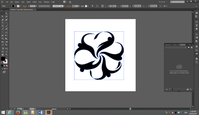
After I decided what the actual logo was going to look like I started to play around with the different colours that I was going to use for my logo. All I did to the original logo image was copy some of the shapes and manipulate the slightly to make them look like my own. I also added slightly more shapes to the logo itself.
After I had decided upon a first colour I then started to play around with the font that I was going to use within my logo. Firstly, I went with a fancy typography but after consideration I thought that this added way too much to the logo itself and made it took way too professional.
Experiment 2
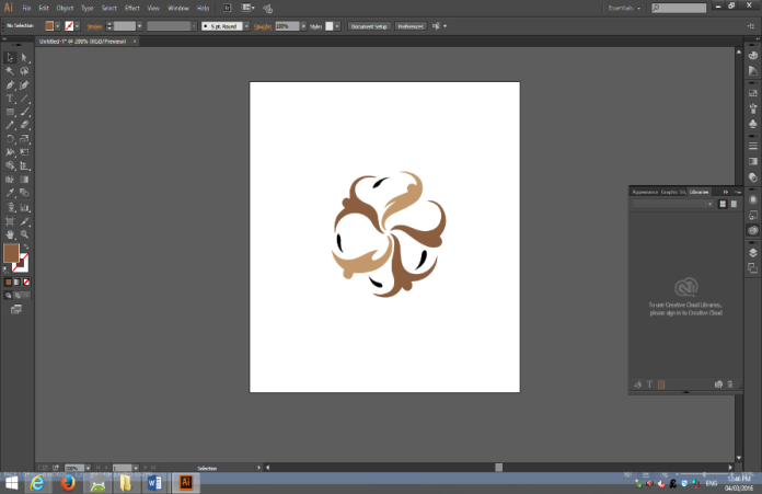
For my second try with creating the logo I decided to take the main logo that I had already created and decided to copy the main image.
In this screenshot I decided to use a completely different typography to the logo that I decided looked alright and looked quite professional looking.
For this experiment I was quite pleased with the way that the logo turned out and was happy with the progress that I had made with the completion of the logo itself.
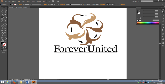
Whenever I came back to the logo I then decided that I was not happy with the logo itself and then decided that it needed a lot more into the logo to make it look less bare and to add a bit of uniqueness to the logo and to make it stand out a little more than it currently is.
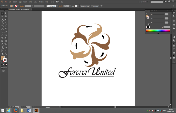
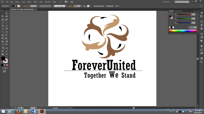
What I the decided to do with the logo was that I decided to put a small dark line in between the letters to make the letters look slightly less cluttered and slightly more spaced and laid out to make the logo look more professional looking to people who were viewing it. I also decided to change the orientation of the logo and put the logo on the left hand side instead of the top.

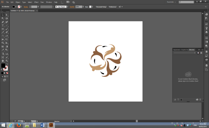
This was what the logo looked like before I decided to change its orientation to a more professional standard.
Whenever designing the logo, I thought about adding a second line to the slogan that I had created, however I strongly started to decide against this as the lines that had been implemented into the design itself started to look quite repetitive. So I decided against putting a second line into the design.
Final Design
In the end of the experiments I decided that the colour that I had chosen did not seem right for the design and did not seem to match the message that was trying to be displayed on the logo. In the end I decided to make the images on the logo a light blue and also slightly darker green to give the logo a clean effect and also make the logo look slightly more modern to increase its appeal.

Business Card
Experiment 1
The business card was not too difficult to create and along with the logo I decided to change in the end, however this is the first design idea that I came up with and all I needed to do for this was to copy the logo image across and copy the logo itself to create a front page for the business card to sit upon.

Experiment 2
The second design that I decided upon was slightly more practical and I decided then to add in some more detail about myself that was usually be situated on a normal business card. I also decided to try the colour blue as it might have been a change from the normal colours that I was using at the time.

Experiment 3
Whenever designing the business card I kept deciding on different places for the location, I also decided to test out another colour to see how the colour itself look and felt on the business card.
Final Design
In the end I decided upon a lighter blue, I also decided that in the business card I would leave the colour of my logo brown on the cover page of the business card brown as it matched the colours that I would using quite well.
This was whenever I re-added the logo of the company back to the business card, however in the next screenshot I decided to change the business card to the lighters final colours that it now is.

This is the final design of the business card itself with all of the information added and also the implementation of the new business card design.
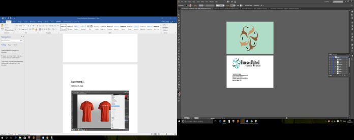
T-Shirt Design
Experiment 1
Rasterizing the image
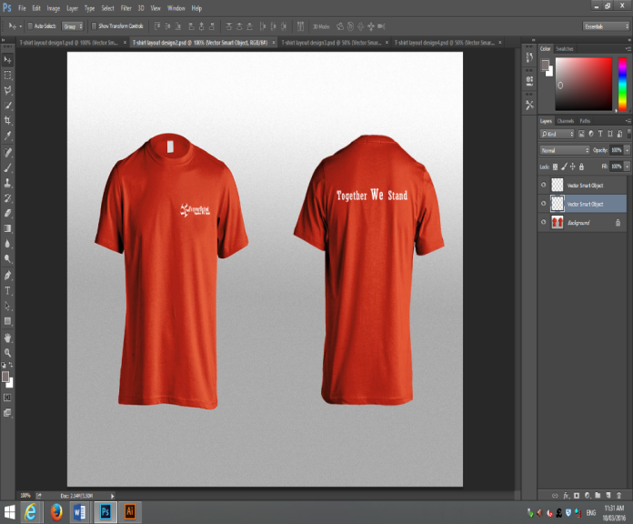
In creating the t-shirts of the company I needed to first rasterise the image and then I could start to add my logo and also slogan onto the t-shirt itself, I decided to not go too overboard with the design of the t-shirt itself as I do not think I needed to. I first started with an orange t-shirt.
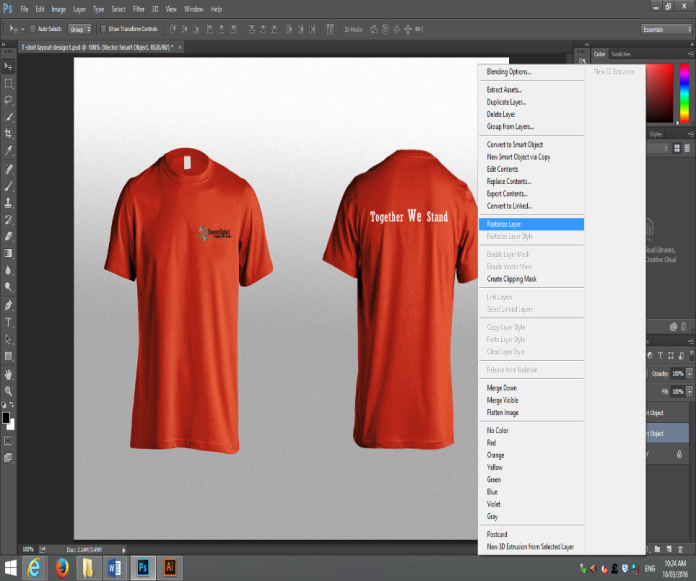
After firstly doing a dark colour for the design layout of the logo and slogan, I then decided to do a slightly lighter version on the t-shirt test and see how the t-shirt looked with a slightly lighter text.
Experiment 2
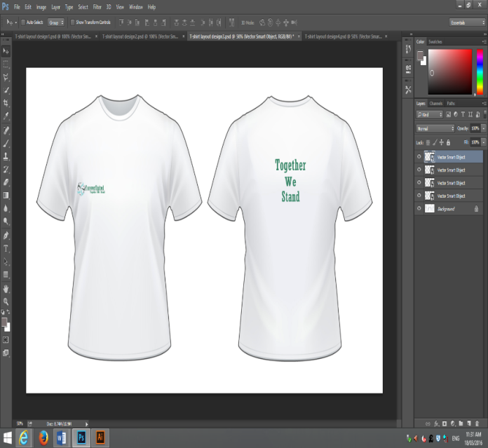
After experimenting with a darker t-shirt I then decided to experiment on a lighter shirt with slightly darker colours.
Final Design
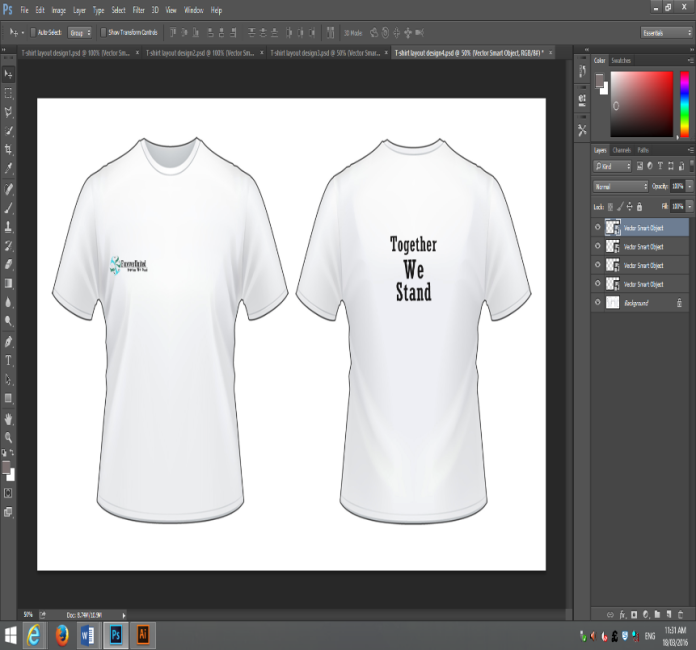
After experimenting with some different choices I decided to pick the white t-shirt as the final design with darker colours and the proper coloured logo that goes quite well with the white t-shirt.
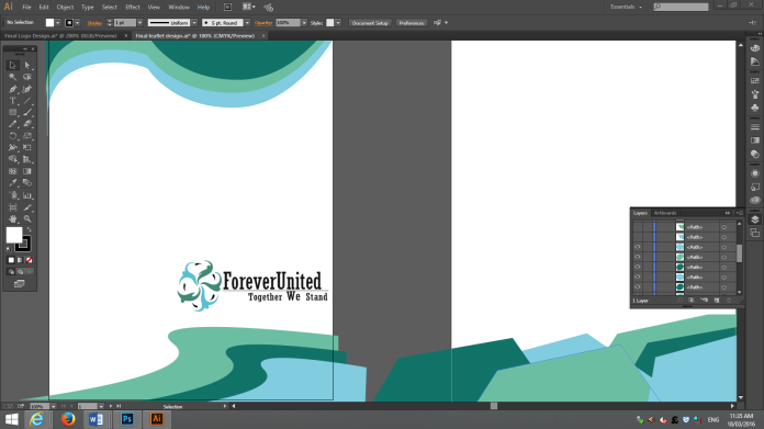
Leaflet/Brochure Design
Experiment 1
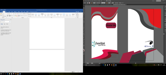
Whenever experimenting with the brochure itself, I decided that some wavy shapes and some strange shapes would make the brochure stand out from the rest of designs but still represent the message that is trying to be put across. The first colour that I started with was a dark red along with some different greys.
Experiment 2
After experimenting with some of the lighter colours I decided that it was time to delve into some darker colours just to experiment and see what the colours looked like in relation to the logo itself.

Final Design
After experimenting with all the different colours I decided to pick slightly lighter but also darker colours that would match the logo.


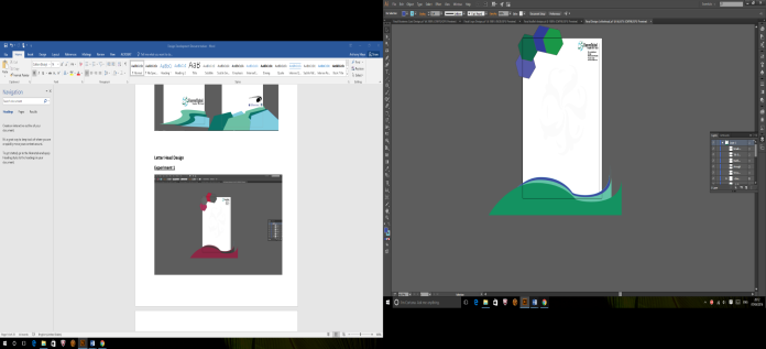
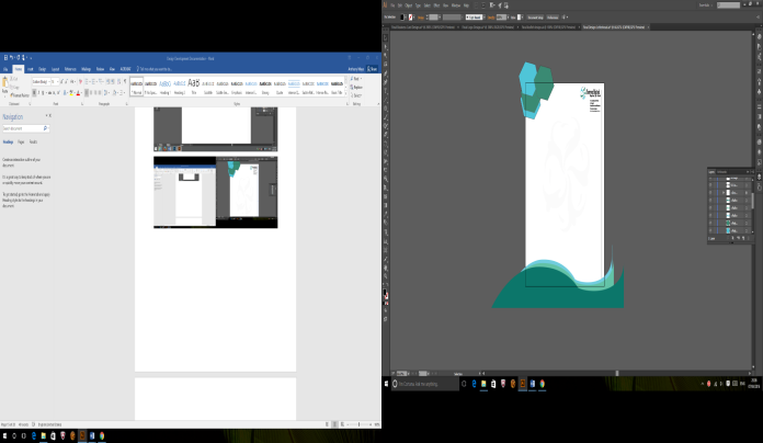
Letter Head Design
Experiment 1
In this screenshot I decided to experiment with different shapes of grey and see what would match the design that I needed for the letter head itself.

Experiment 2
In this screenshot I decided to change the colours around a little and use some different blues and also greens to see if it would.
Final Design


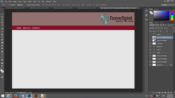
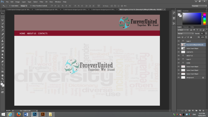
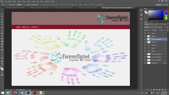
Web Graphics
Experiment 1